
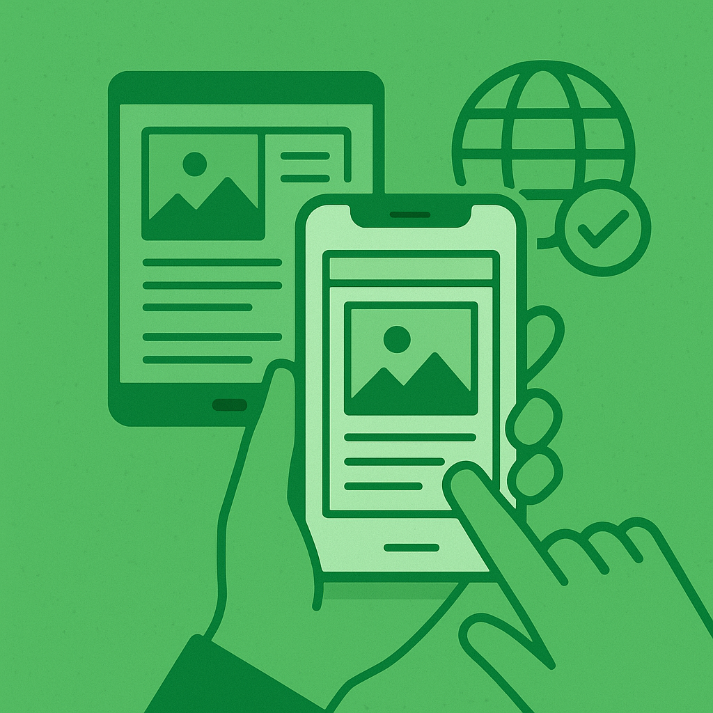
📲 How to Make Your WordPress Website Mobile-Friendly
If your website doesn’t look great on mobile, you’re losing traffic, clients, and SEO rankings. More than 60% of web traffic comes from mobile devices today—and Google prioritizes mobile-first indexing. Fix mobile responsive issues WordPress.
In this guide, UPWeb Services shows you how to fix mobile responsiveness issues in WordPress the right way.
⚠️ Signs Your Site Isn’t Mobile-Friendly
- Text is too small or zoomed in
- Layout breaks on phones
- Buttons are too close together
- Google’s Mobile-Friendly Test fails
✅ Step-by-Step Guide to Make Your WordPress Site Mobile-Friendly
1. Choose a Mobile-Responsive Theme
Some themes are outdated and not optimized for mobile.
🔧 Recommended responsive themes:
- Astra
- Neve
- GeneratePress
- Kadence
- Hello Elementor
💡 Pro Tip: Always test your theme on real devices before publishing.
2. Use Responsive Page Builders
Page builders make it easier to adjust how your content looks on phones.
📱 Best options:
- Elementor (with mobile editing tab)
- WPBakery
- Bricks Builder
- Gutenberg blocks with Stackable/Kadence Blocks
📍 In Elementor, use the Responsive Mode (bottom left screen icon) to design for mobile, tablet, and desktop separately. Fix mobile responsive issues WordPress.
3. Test Your Site with Google’s Mobile Tool
Run this test:
🔗 Google Mobile-Friendly Test
Fix anything flagged, like text size, viewport settings, or image scaling.
4. Avoid Fixed-Width Elements
Never use fixed widths like width: 800px; in custom CSS.
Use relative units like:
cssCopyEditmax-width: 100%;
width: auto;
🧠 Use percentages or vw/vh instead of pixels for layouts.
5. Use Mobile Menu Plugins (If Needed)
If your theme lacks a good responsive menu, try:
- WP Mobile Menu
- Responsive Menu
- Max Mega Menu (mobile optimized)
6. Don’t Overload Your Site
Too many popups, banners, or sliders = slow and clunky on mobile.
✅ Keep it clean. Mobile users want speed and clarity.
💼 Want Your Site Mobile-Optimized by Pros?
If your site isn’t mobile-friendly, UPWeb Services can redesign or optimize it fast. We make sure it looks perfect on all screen sizes—from phones to tablets to desktops.
👉 Message us now for a free mobile audit.